How I Built a Spoiler Web Component for My Site
Every once in a while I like writing about a video game I’m playing, a movie or TV show I watched. I’m often a little behind things nowadays, but even so, I try to be careful as to not spoil it for anyone reading who might not have watched the latest episode or have gotten that far into the game yet.
One of the nice features of Mastodon, is the ability to put things behind a content warning. But while it can certainly be used for more sensitive matters, it can also be used for spoilers, providing people the ability to discuss the latest TV episode or whatnot, without having to worry about ruining it for someone else, as the original post, and all the replies go behind the filter.
This is basically what I was looking to do for my site. And what do you know, web components make it easy, especially with 11ty.
I created a webc file called spoilers.webc.
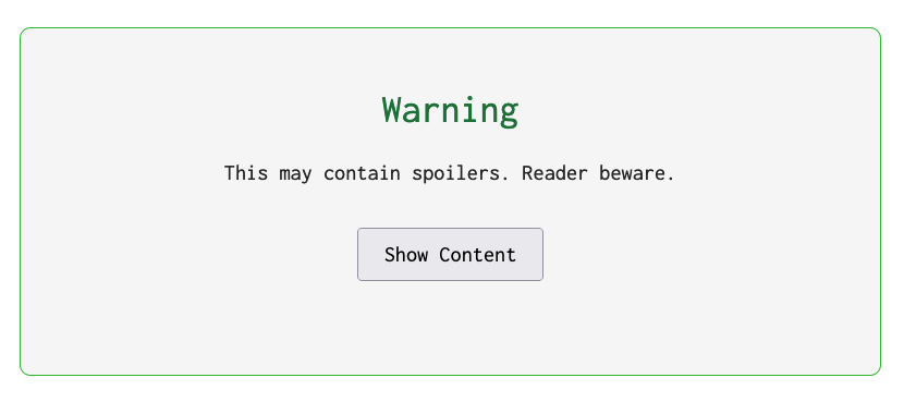
<div class="spoiler secret">
	<div class="warning">
		<h2>Warning</h2>
		<p>This may contain spoilers. Reader beware.</p>
		<p><button type="button" class="show-content">Show Content</button></p>
	</div>
	<div class="content">
		<slot></slot>
	</div>
</div>
In it, I set up 2 main content areas. The top one with the .warning CSS class, and the other with the .content CSS class. The <slot></slot> indicates to the component where the content I want to initially hide goes.
The next step was setting up the styling.
<style webc:keep>
	.spoiler .warning {
		border: 1px solid var(--primary-color-3);
		background: var(--shaded-background);
		padding: 3rem 0;
		text-align: center;
		border-radius: 10px;
	}

	.spoiler .warning h2 {
		font-size: 2rem;
	}

	.spoiler .warning button {
		padding: 4px 20px;
		cursor: pointer;
	}

	.spoiler.secret .content,
	.spoiler.shown .warning {
		display: none;
	}

	.spoiler.shown .content {
		display: block;
	}

	.spoiler.secret {
		display: block;
		width: 100%;
	}
</style>
I styled the warning div to look nice with the content.
The important lines are:
.spoiler.secret .content,
.spoiler.shown .warning {
	display: none;
}

.spoiler.shown .content {
	display: block;
}
Here, I’m telling the browser, when the .secret class is applied to the .spoiler div, do not show the content, but when the .secret class is removed, and the .shown class is added, hide the warning, and show the content.
The final piece was adding the JavaScript. I would’ve preferred to not use JavaScript, but I don’t know how to do this without JS. If you have an idea, let me know! Thankfully, we don’t need much.
<script webc:keep>
	window.addEventListener('load', () => {
		const showButton = document.querySelector('button.show-content');

		if (showButton) {
			showButton.addEventListener('click', () => {
				const spoilerDiv = document.querySelector('div.spoiler');
				spoilerDiv.classList.remove('secret');
				spoilerDiv.classList.add('shown');
			});
		}
	});
</script>
The JavaScript isn’t terribly complicated. When the window loads, I look for the button using its query selector button.show-content. I then attach an event handler for the click event to find the parent div div.spoiler to remove the .secret class and add the .shown class. This will cause the warning to disappear and the content to appear in its place.
Then, to use it in a blog post, I had to configure the render plugin. This is needed since I write my posts in markdown to be rendered using the Liquid syntax. Once that was configured, the final step is to use it.
{% renderTemplate "webc" %}
<spoiler>
	Psst...this is a spoiler!
</spoiler>
{% endrenderTemplate %}
Limitations
The biggest limitation of this as it stands now is that it’s really limited to one per page. For my intents and purposes, that’s fine. If it ever comes up for me that I need more, I’ll revisit it and maybe find a way to put a unique ID on the controls.
The Final Component
In case you want it for your own uses, here’s the final code.
<div class="spoiler secret">
	<div class="warning">
		<h2>Warning</h2>
		<p>This may contain spoilers. Reader beware.</p>
		<p><button type="button" class="show-content">Show Content</button></p>
	</div>
	<div class="content">
		<slot></slot>
	</div>
</div>

<style webc:keep>
	.spoiler .warning {
		border: 1px solid var(--primary-color-3);
		background: var(--shaded-background);
		padding: 3rem 0;
		text-align: center;
		border-radius: 10px;
	}

	.spoiler .warning h2 {
		font-size: 2rem;
	}

	.spoiler .warning button {
		padding: 4px 20px;
		cursor: pointer;
	}

	.spoiler.secret .content,
	.spoiler.shown .warning {
		display: none;
	}

	.spoiler.shown .content {
		display: block;
	}

	.spoiler.secret {
		display: block;
		width: 100%;
	}
</style>

<script webc:keep>
	window.addEventListener('load', () => {
		const showButton = document.querySelector('button.show-content');

		if (showButton) {
			showButton.addEventListener('click', () => {
				const spoilerDiv = document.querySelector('div.spoiler');
				spoilerDiv.classList.remove('secret');
				spoilerDiv.classList.add('shown');
			});
		}
	});
</script>